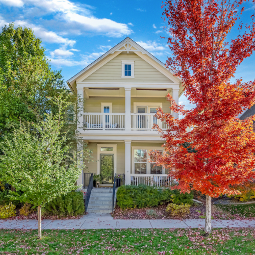



Something is shifting in Denver homes. The bright, cool minimalism that defined so many interiors over the past decade is giving way to something warmer, softer, and more personal. Homeowners are gravitating toward spaces that feel genuinely comfortable rather than carefully curated, and the change is showing up in everything from paint colors to furniture choices to the way people are thinking about light.
Warm interiors in fall 2026 are not about going dark or heavy. The shift is more refined than that. It means medium and dark woods like walnut and smoked oak, clay and mineral-inspired colors on walls and in textiles, fabrics that have texture you can actually feel, softer and more layered lighting, and rooms that look like they came together over time rather than all at once from a single showroom.
Among the Denver interior design trends taking shape this fall, the return to warmth feels particularly well suited to the city. Denver has its own light, its own climate, and its own architectural character that makes warm interiors feel less like a national design import and more like a natural response to the place itself. Whether you want a full design refresh before fall or just a few well-chosen updates, the ideas here are practical and specific to where you live.
What Warm Interiors Actually Look Like in 2026
The easiest way to understand the 2026 version of warm interiors is to separate it from the rustic or farmhouse aesthetics that saturated design spaces a decade ago. This is not shiplap and mason jars. The warmth showing up in homes right now is more considered, blending comfort with cleaner lines and a sense of personal history.
The core materials driving the look are walnut and smoked oak for furniture and cabinetry, mushroom and clay tones on walls and in soft goods, wool and linen for upholstery and drapery, aged brass in hardware and fixtures, and layered lamplight that replaces the flat overhead lighting that made so many open-plan spaces feel cold. These are not trend-of-the-moment choices. Designers working at the national level are increasingly treating this palette as a long-term foundation rather than a seasonal experiment.
What makes 2026 warmth feel current rather than dated is restraint. Rooms are not trying to match everything or commit to a single theme. A walnut dining table might sit alongside a plaster-finish wall and a vintage rug with some age to it. The mix is intentional but not rigid. That balance is what separates a warm interior that feels fresh from one that feels heavy or overdone.
For Denver homeowners who have spent years in spaces that skewed cool and minimal, this shift can feel surprisingly freeing. There is room to bring in pieces that actually mean something, to choose colors that respond to the season outside the window, and to build a home that feels genuinely personal. That is the real appeal of this direction, and it is why it is resonating well beyond a single design cycle.
Why This Trend Makes So Much Sense in Denver
Denver gets roughly 300 days of sunshine per year, and that light is not soft or diffused. It is direct, high-altitude, and intense for much of the day. In a room painted bright white or cool gray, that kind of light can read as harsh by mid-morning, flattening surfaces and making spaces feel more clinical than calm. Warmer tones behave differently under the same conditions. Clay, buff, and warm putty absorb and reflect Denver's sun in a way that feels grounded rather than glaring.
The seasonal shift also matters here more than it does in milder climates. Denver falls arrive fast. Evenings cool down quickly, the light drops earlier, and the city moves indoors in a way that makes you notice how a room actually feels to sit in. A space that worked fine in July can feel stark by October. Warm interiors are built for exactly that transition, and the layered quality of the look, textiles you can add or remove, lamps that change the mood of a room after dark, and colors that respond well to both bright afternoon light and dim evening light, makes it especially practical here.
There is also a geographic dimension to this. The Front Range landscape is full of the same tones that define this trend. Tobacco, sage, adobe, and mineral brown are not abstract color names in Colorado. They describe the actual terrain. Bringing those tones inside creates a visual continuity between the outdoors and the interior that feels authentic rather than forced, particularly in homes with mountain views or direct access to trails and open space.
Denver's indoor-outdoor rhythm reinforces this further. Mudrooms, great rooms, and breakfast nooks are all spaces where people move between outside and in throughout the day. Layered interiors, ones with rugs that can handle some use, fabrics that are durable as well as soft, and wood that develops character over time, hold up better to that kind of living than spaces built around pristine white surfaces and minimal ornamentation.
This is not a trend that arrived in Denver from a design magazine and happened to catch on. It fits the climate, the landscape, and the way people actually use their homes here.
The Fastest Ways to Warm Up a Room Without Remodeling
Swapping out a few key elements can shift the feeling of a room faster than most people expect, and you do not need a contractor to do it. The two highest-impact changes tend to be wood and lighting. A medium-toned wood side table or bench, even a single piece, introduces warmth that a room full of painted furniture or metal accents simply cannot replicate. At the same time, changing your bulb temperature from cool white to a warm white in the 2700K range makes an immediate difference, especially in the evening hours when Denver homes shift from bright to dim.
From there, the updates stack up naturally. Here is a practical breakdown by budget tier:
- Low-cost accessory changes - Swap out cool-toned throw pillows, vases, and decorative objects for warmer alternatives. Terracotta, amber glass, raw linen, and natural wood accents are widely available at places like Target's Threshold line, IKEA's SINNERLIG collection, and local shops along South Broadway. These changes cost very little but shift the visual temperature of a room noticeably.
- Mid-range textile and window treatment updates - Replacing white or gray curtains with linen or cotton-linen blend drapery in warm putty, oat, or soft tobacco tones is one of the most effective moves at this level. Adding a wool or jute area rug, or layering a smaller vintage rug over an existing one, also changes how a room feels underfoot and visually.
- Higher-investment cabinetry or millwork changes - If you are ready to commit more budget, replacing white or gray painted cabinetry with a warmer finish, or adding walnut open shelving in a kitchen or living area, creates a change that is harder to achieve with accessories alone.
One detail that is easy to overlook is how Denver's light shifts throughout the day. A paint color that reads as a warm clay at noon can pull orange or pink by late afternoon. Always test paint samples and fabric swatches in both morning and late afternoon light before committing. What looks right in the store or on a screen may read very differently once it is living in your specific space.
The Materials and Colors That Feel Fresh This Fall
The wood story this season centers on medium and dark tones that have some visual complexity to them. Walnut remains the strongest choice, with its warm brown grain that reads as rich without being heavy. Espresso oak and smoked oak are also showing up frequently, particularly in cabinetry and built-ins, because they add depth without the formality of traditional dark stains. Mushroom-stained white oak sits at the lighter end of this spectrum and works well in spaces that need warmth without going too deep.
The color palette running alongside these woods is equally specific. Clay, adobe, buff, camel, olive, tobacco, and warm putty are the tones that feel current right now, and they share a quality that makes them durable choices beyond a single season. They are all pulled from natural mineral and earth sources, which means they do not read as trendy in the way that highly saturated or fashion-forward colors tend to. They age well on walls and in textiles, and they work across different levels of natural light.
Tactile surfaces are just as important as color. Honed stone countertops and plaster-like wall finishes add a matte, organic quality that polished surfaces cannot replicate. Woven shades, leather details on furniture, linen drapery, and handmade ceramics all contribute a kind of depth that comes from variation in texture rather than contrast in color. A room built around these materials does not need a lot of decorative objects to feel complete because the surfaces themselves carry the visual interest.
The contrast worth noting is with the cooler, more polished aesthetic that dominated the previous few years. Stark black and white schemes, high-gloss finishes, and cold gray undertones can feel less inviting as the season shifts. That does not mean those choices were wrong, but they tend to work harder in warmer months when the light is bright and the windows are open. As fall settles in, rooms built around matte, warm, and tactile materials simply feel better to be in.
Mixing these elements without making everything match is easier than it sounds. The key is to stay within a consistent warmth range across your major surfaces and then let the smaller pieces, ceramics, textiles, vintage finds, introduce variation. A room where the wood, wall color, and rug all pull warm will hold together even when the individual pieces are quite different from each other.
How to Make Warm Interiors Work in Different Denver Home Styles
Warm interiors do not look the same across every type of Denver home, and they should not. The goal is to make the trend feel like it belongs to the architecture rather than sitting on top of it.
Historic Homes in Wash Park and Similar Neighborhoods
Older Denver homes in neighborhoods like Washington Park, Capitol Hill, and Park Hill already have warm bones. Original brick, painted millwork, wood floors with age and patina, and traditional room proportions are all assets that the current trend plays to naturally. The move here is to honor those existing features rather than modernize around them. Richer wood tones in furniture, antique or vintage rugs with some wear, picture lighting above artwork, and a fireplace treated as a genuine focal point rather than a decorative afterthought all reinforce what is already working in these homes. A deep clay or warm ochre on walls can make original millwork stand out in a way that white or gray paint simply does not.
Contemporary Infill Homes
Newer infill construction in neighborhoods like Berkeley, Sunnyside, and Sloan's Lake often features open floor plans, large windows, and clean architectural lines. The challenge in these spaces is that they can feel cold without some deliberate softening. Walnut built-ins, linen drapery that runs floor to ceiling, bronze or aged brass fixtures, and a warmer paint color on a single accent wall are all ways to introduce warmth without compromising the clean quality of the architecture. Softer paint colors in the clay and warm putty range also help these spaces feel less stark when the light shifts in the evening.
Mountain-Modern Homes
Homes designed in a mountain-modern style often have dramatic scale, large volumes of space, and significant glazing. Those qualities are assets in summer but can make rooms feel cavernous and cold once fall arrives. Darker woods, layered textiles including multiple rugs and heavier throw blankets, and a more deliberate approach to evening lighting with floor lamps and table lamps rather than relying solely on recessed fixtures all help bring these spaces down to a more human scale. Softer accent colors on interior walls, particularly in rooms that do not have mountain views competing for attention, also make a meaningful difference.
Collected Rooms Feel Better Than Staged Ones
The deeper shift behind the warm interiors trend is a change in how people want their homes to feel, not just how they want them to look. Rooms that appear assembled over years, with pieces that have different origins and different levels of age, communicate something that a perfectly matched interior simply cannot. They feel inhabited. They feel like someone actually lives there and has made real choices over time.
This does not mean filling a room with clutter or committing to a maximalist approach. It means being intentional about introducing at least one piece per room that has some history or character to it. A vintage rug found at a Denver estate sale, a sideboard passed down from a family member, a ceramic lamp made by a local artist, a landscape painting from a Colorado gallery, or even a wooden stool picked up at a flea market can anchor a room in a way that new furniture alone rarely achieves. These pieces become the ones people actually notice and ask about.
Mixing vintage and new is also more forgiving than trying to make everything match. When a room has one piece with genuine age and character, the newer pieces around it tend to look more considered rather than generic. The contrast works in your favor. A clean-lined sofa looks more interesting next to a worn antique coffee table than it does next to a brand-new one in a similar style.
Warm interiors that reflect personal taste also tend to hold up better over time than those built around a specific trend moment. When the choices in a room come from real preference rather than what was popular at a particular time, they do not date in the same way. That is the practical argument for building a home around things you actually respond to rather than things that photograph well right now. Comfort, imperfection, and individuality are not design compromises. In fall 2026, they are exactly the point.
Bringing It All Together
Warm interiors are returning to Denver homes because they work here. The light, the climate, the architecture, and the pace of life in this city all point toward spaces that are layered, grounded, and personal rather than minimal and cool.
The practical starting point is the same regardless of your budget or how far you want to take the refresh. Wood and lighting are the two changes that shift a room's feeling fastest. A warmer bulb temperature and a single piece of medium-toned wood furniture will do more than a new set of decorative accessories. From there, textiles, paint color, and surface finishes can build on that foundation at whatever pace makes sense.
Denver's sun is one of the most important variables to keep in mind throughout this process. The same color that looks perfect in a showroom can read completely differently under high-altitude afternoon light. Testing materials in your actual space, at different times of day, is not optional here. It is the step that separates a change you will love in six months from one you will want to redo.
The homes that achieve this look most successfully are not the ones that followed the trend most closely. They are the ones where the warmth feels like it was always there, like the space simply grew into itself over time. That is the goal worth working toward.
If you're thinking about how your current home fits the way you want to live—or what you'd look for in your next Denver home—get in touch with Olivia.
Frequently Asked Questions About Warm Interior Design in Denver
What interior design trends are popular in Denver in 2026?
Denver interior design trends in 2026 are moving toward warmer, more layered spaces. Medium and dark woods, earthy paint colors, natural materials, textured fabrics, vintage pieces, and softer lighting are replacing some of the cool grays, bright whites, and highly polished finishes that were popular in previous years. These choices work especially well in Denver because they complement Colorado's natural landscape and strong sunlight.
What colors are trending for Denver homes this fall?
Warm, earth-inspired shades are especially popular for fall 2026, including clay, adobe, camel, mushroom, olive, tobacco, buff, and warm putty. These colors pair naturally with materials like walnut, oak, leather, linen, stone, and aged brass. Denver homeowners should test paint colors at different times of day because the city's bright, high-altitude sunlight can noticeably change how a color appears.
How can I make my home feel warmer without remodeling?
Lighting and wood tones are two of the easiest places to start. Switching cool bulbs for warm white bulbs around 2700K can immediately soften a room, while introducing a walnut or medium-toned wood table, bench, shelf, or cabinet adds visual warmth. Rugs, linen curtains, textured pillows, artwork, and warmer paint colors can then build on those changes without requiring a major renovation.
Do warm interior trends work in modern Denver homes?
Yes. Contemporary Denver homes can benefit from warmth without losing their clean, modern character. Walnut built-ins, linen drapery, warm neutral paint, aged brass or bronze fixtures, textured rugs, and layered lighting can soften large windows and open floor plans while preserving modern architectural lines.
What design updates should I make if I plan to sell my Denver home?
If you are preparing to sell, focus first on updates that improve the overall presentation of the home rather than making major changes solely to follow a trend. Warm lighting, thoughtful styling, refreshed paint, updated textiles, and removing overly dated finishes can help rooms feel more inviting. Larger renovations should be considered in the context of your home's condition, neighborhood, price point, and likely buyer expectations.
How does Denver's natural light affect interior paint colors?
Denver receives strong, direct sunlight, which can make bright whites, cool grays, and certain saturated colors look different than they do in a store or online. Warm shades can also shift throughout the day; for example, a clay color may become more orange or pink in late-afternoon light. Testing large paint samples in the actual room during both morning and afternoon is the best way to see how a color will behave.
Check out this article next