


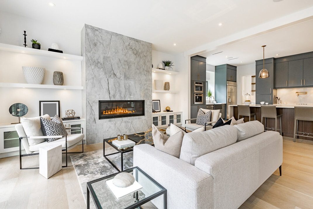
A fresh coat of paint is one of the few pre-listing updates that costs relatively little but can shift how a buyer feels the moment they walk through the door—and in a competitive market like Denver, that first impression carries real weight. The problem most homeowners run into is not a lack of color options, but a lack of a clear strategy. Grabbing the trendiest shade off a Sherwin-Williams or Benjamin Moore display might feel like the right move, but colors that feel exciting in 2026 can just as easily feel dated by the time a buyer schedules a showing two years from now.
The smarter play is building a palette that feels current without boxing you into a corner—one that works with Denver's specific light conditions, complements the architectural styles common across neighborhoods like Washington Park, Highlands, or Stapleton, and still gives buyers enough visual breathing room to see themselves living there.
This blog walks through a practical framework for doing exactly that, covering how to read 2026 color trends without overcommitting to them, where bold color can actually help a sale, and where timeless neutrals still outperform anything trend-driven.
Whether you're preparing to list, getting ready to buy, or just moving to Denver and trying to figure out what works here versus what looks good on a design blog, the guidance ahead can help you make color decisions you won't regret—so where do you even start?
Start with a Base Color Buyers Already Trust
Before settling on an accent wall or a trending hue you spotted on a design blog, lock in your main wall color first. That foundational shade sets the tone for every other decision in the room—the trim, the furniture, the fixtures—and getting it right from the start saves you from costly repainting cycles down the line. HGTV puts it plainly: "choosing the right paint color can make your home more appealing to buyers," and that appeal almost always starts with the walls buyers see first.
The color families that consistently perform well for resale share one thing in common—they feel familiar without feeling boring. Here are the tone groups worth considering:
- Warm whites — shades with a slight cream or ivory undertone read as clean and bright in listing photos without the harshness of a stark, cool white. They make kitchens and hallways feel open and well-maintained.
- Soft greige — a blend of gray and beige that sits comfortably between cool and warm. It pairs naturally with Denver's wood-heavy interiors and works across different lighting conditions throughout the day.
- Mushroom neutrals — deeper than greige but still understated, these tones add depth to living rooms and dining areas without feeling heavy or overly personal.
- Taupe — a reliable mid-tone that photographs well and complements both modern and traditional finishes common in neighborhoods like Wash Park or Hilltop.
- Light clay — a warmer, earthier option that connects well with Denver's natural surroundings and feels grounded without veering into bold territory.
Steering away from cool grays and stark whites is worth the effort. Cool grays can read as flat or icy under Denver's high-altitude light, especially in rooms that face north or get limited afternoon sun. Stark whites, while clean in theory, often feel clinical in listing photos and can make a space feel less lived-in and less welcoming. HGTV notes that "neutral colors are often best because they allow buyers to envision themselves in the space"—and warmer neutrals do that job better than cooler ones, simply because they feel less sterile and more like a home someone would actually want to move into. Choosing a shade that appeals to the widest range of buyers means thinking less about personal preference and more about what makes a room feel immediately comfortable to someone walking through for the first time.
Add 2026 Trend Colors Where They Do the Most Work
Knowing which colors are trending is only half the equation–the other half is knowing how much of your home to commit to them. Applying a single trend color across every room is the kind of decision that feels exciting during a weekend paint project but can quietly work against you when it's time to sell. The goal is to use what's current in a way that reads as intentional rather than all-in.
What the 2026 Palette Actually Looks Like
The color directions gaining the most traction heading into 2026 lean toward the organic and grounded. Warm earthy neutrals are showing up alongside muted sage and soft olive, while deeper options like smoky jade, terracotta, and moody blue are drawing attention in more curated spaces. Soft black accents are threading through interiors as well, adding definition without the visual weight of a full dark room. Benjamin Moore's 2026 palette frames this direction well—"each hue was selected for its ability to stand alone or work in harmony with the others," which speaks to how versatile these shades are when used with restraint rather than saturation.
Where These Colors Earn Their Place
Smaller, more contained spaces are where 2026 trend colors achieve the most without creating risk. A front door painted in a moody terracotta or deep sage signals personality and design awareness from the curb without committing the interior to a specific mood. Powder rooms are another strong candidate—because they're compact and rarely the deciding factor in a sale, they can carry a bold or unexpected shade without making a buyer hesitant. Kitchen islands painted in a muted olive or soft black give a space a finished, considered look that photographs well and feels current without requiring a full kitchen overhaul.
Office accent walls and secondary bedrooms follow the same logic. These are spaces buyers tend to mentally reassign anyway—a home office becomes a nursery, a guest room becomes a gym—so a trend-forward color there reads as a design detail rather than a permanent statement. Behr's Hidden Gem, a smoky jade green, is a strong example of this approach done well. It carries enough depth to feel sophisticated but sits in a muted enough register that it doesn't overwhelm a room or clash with the rest of the home's palette.
Keeping trend colors contained to these lower-stakes areas means a future buyer isn't mentally calculating how many rooms they'd need to repaint before moving in. A home that feels current in its details—a door, an island, a single accent wall—still achieves the design-forward impression that makes a listing stand out, without the personalization that narrows buyer appeal. Sellers who achieve this balance tend to spend less on pre-listing prep and avoid the cycle of repainting spaces that were updated too aggressively the first time around.
Save the Bold Moves for Places That Can Carry Them
Not every room in your home plays the same role in a sale, and that distinction matters more than most sellers realize. Some spaces are low-stakes enough to carry a strong, personal color without pushing buyers away—and others are decision-making rooms where the wrong shade can quietly cost you offers before negotiations even start.
- Rooms that can handle bold color — powder rooms, home offices, dining rooms, and front doors are the spaces where personality genuinely adds value. A powder room is small, self-contained, and rarely a dealbreaker, which means a deep terracotta or moody navy reads as a design choice rather than a commitment a buyer has to live with. Home offices follow the same logic—buyers mentally repurpose them anyway, so a rich sage or charcoal accent wall feels intentional rather than intrusive. Dining rooms have historically supported deeper, moodier tones because they're used in shorter bursts and benefit from atmosphere. Front doors are perhaps the most forgiving canvas of all–a bold color there signals character from the curb without affecting a single interior wall.
- Rooms where neutral colors should lead — main living rooms, entryways, hallways, and most kitchen walls are the spaces that shape how a buyer feels about the entire home. These are the rooms buyers spend the most time in during a showing, and they're also the rooms that appear most prominently in listing photos. A dramatic or highly personal color in any of these areas forces buyers to mentally subtract it from the home before they can see themselves in it. Laura Freeman of Merits Design Group puts it directly—neutral paints "create the perfect backdrop, allowing furnishings and architectural details to shine." That flexibility is exactly what buyers in these spaces are looking for. An entryway painted in a warm greige or soft white sets a tone of openness that carries through the rest of the showing.
Darker or highly personal walls in high-traffic, high-visibility rooms do something specific to buyer psychology—they introduce a perceived cost. A buyer walking into a living room with deep charcoal walls isn't just seeing a color they might not love; they're mentally calculating the labor and materials needed to cover it, and that number gets subtracted from what they're willing to offer. This effect is most pronounced in entry-level and mid-range Denver homes, where buyers are already stretching their budgets and have less tolerance for post-purchase projects. Timeless colors, like warm whites, soft greiges, muted taupes, consistently outperform trend-driven choices in the rooms that buyers see first and remember longest, not because they're exciting, but because they inspire confidence that the home is move-in ready.
Let Denver Sun and Natural Light Guide the Final Shade
Denver sits at 5,280 feet above sea level, and that altitude changes everything about how paint behaves on a wall. The UV exposure here is significantly more intense than at lower elevations, the sunlight arrives sharper and more direct, and the temperature gap between a warm afternoon and a cool evening can swing by 30 to 40 degrees in a single day. These conditions mean that a color swatch approved in a Chicago showroom or a New York design studio may look completely different once it's on a Denver wall—which is why local light conditions should carry more weight in your final decision than any trend forecast.
Inside the home, the direction a room faces determines how much that color shifts throughout the day. North-facing rooms are known for receiving less direct sunlight and often have cool light, which means colors with cool undertones will make the room appear even colder and more washed out than intended. Instead, choose a warm neutral or a color with warm undertones—this will help balance out the cool lighting in the room and keep the space feeling grounded rather than stark. South- and west-facing rooms work differently. Since south-facing rooms experience warm light, choosing a color that's too warm can result in moments during the day when that warmth reads as overwhelming or overly bold. Softer off-whites and warm neutrals tend to hold up better in these rooms, where a bright, cool white can turn harsh and glaring under peak afternoon sun.
On the exterior, Denver's UV intensity creates a fading problem that most homeowners don't account for until it's too late. Saturated, highly pigmented colors—think a rich navy, a deep burgundy, or a vivid forest green used across the full body of a home—break down faster under consistent high-altitude sun exposure. Deeper greens and charcoals hold up better when used selectively, as trim accents, shutters, or front door details, rather than as the dominant exterior color. This approach also gives a home more visual longevity, since accent colors are far easier and less expensive to refresh than a full exterior repaint every few years.
Selecting a low-sheen finish, such as an eggshell or satin, does something practical that high-gloss options can't achieve in Denver's dry climate. Arid conditions cause wood, drywall, and older stucco to show minor surface irregularities more readily, and a flat or low-sheen finish diffuses light in a way that softens those imperfections rather than drawing attention to them. Pairing that finish with a forgiving warm tone—something in the greige or soft clay range—means the walls hold up better visually between paint cycles and photograph more consistently in listing photos. These aren't just aesthetic choices; they're practical ones that support a home's ability to show well now and age well over time.
Make the Palette Fit Your Home and Your Neighborhood
Architectural color consultant Amy Krane puts it well — "how you approach these choices should be governed by" the style of your home, your regional norms, and what combinations actually work together. A color that looks sharp on a modern Denver infill townhome can look completely out of place on a 1950s ranch two streets over. The most successful exterior palettes aren't the ones pulled straight from a national trend board—they're the ones that feel like they belong to the specific home and the specific block they're on.
- Ranch homes — the low, horizontal profile of a ranch home calls for a warm greige or mushroom body color that reinforces the grounded, spread-out quality of the structure rather than fighting it. Pair that with soft white trim to define the roofline and windows cleanly, then finish with a muted green or charcoal front door for contrast. These tones work because they don't compete with the home's modest, practical character—they support it, and they age well without demanding frequent updates.
- Brick bungalows and older Denver homes — the brick itself is doing most of the visual work on these homes, so the smartest move is to treat it as the anchor and build around it. Updating the trim, eaves, and door with warm off-white, soft black, or deep green gives the facade a refreshed look without erasing the original character. Stark or cool-toned trim fights the warmth of older Denver brick, while these softer, earthier options pull the whole exterior together without looking like a renovation that tried too hard.
- Newer townhomes and infill properties — the heavy black-and-white contrast that dominated modern infill design for the past decade is starting to feel dated, and creamier whites paired with softer olive or dusty blue accents are a more durable direction. These combinations still read as contemporary and clean, but they carry more warmth and visual interest than a flat white body with black window frames. The result is a home that feels designed rather than assembled from a default spec sheet.
- Foothills and mountain-adjacent homes — properties near the foothills or in areas like Evergreen, Morrison, or Genesee sit within a landscape that already has a strong visual identity—stone, timber, dry grasses, and evergreen. Subdued earthy neutrals in warm tan, clay, or muted brown work with those materials rather than against them, and they hold up better visually against the surrounding terrain than anything too saturated or too cool.
Verifying HOA guidelines before purchasing a single gallon of exterior paint is a step that saves real money and real frustration. Some Denver neighborhoods and planned communities have approved color lists, and even blocks without formal HOAs tend to have informal visual norms that are worth observing. Walking the street and noting the dominant exterior palettes nearby gives a clearer picture of what will feel cohesive versus what will stand out for the wrong reasons.
Test the Color Like a Seller and Stage It Like a Pro
Narrowing down a palette to two or three strong candidates is a real achievement—but settling on a color from a small chip or a phone screen is where many sellers lose confidence in their final choice. The way a color performs on an actual wall, under actual light, in the actual room where buyers will be standing, is what determines whether that shade works or doesn't. Testing in real conditions is the step that separates a confident decision from an expensive repaint.
See It on the Wall First
Sherwin-Williams advises that "use large enough samples to accurately evaluate color" rather than relying on small swatches that can't show how a shade behaves across a full surface. The practical approach is to brush two or three candidates onto sections of drywall that are at least two feet wide—large enough to read as a real wall rather than a test patch. Doing this on multiple walls in the same room also matters, since a north-facing wall and a south-facing wall in the same space can make the identical color look like two completely different shades.
Moving those samples around the room is just as important as the size. Sherwin-Williams notes that "it is important to view the color in the space where it will be used before making a final decision"—which means checking how each candidate sits next to the flooring, the cabinetry, and the trim rather than evaluating it in isolation. A warm greige that looks grounded next to hardwood floors can turn muddy next to cream-colored tile, and that kind of interaction only becomes visible when the sample is actually in the room.
Keep the Main Floor Reading as One Space
Once the right shade is confirmed, applying it consistently across the main floor does something specific to how buyers experience the home during a showing. When the living room, hallway, and dining area share the same wall color, or at least colors from the same tonal family, the eye moves through the space without interruption. That visual continuity makes square footage feel more generous and gives stagers far more flexibility, since furniture and décor don't have to compete with abrupt color shifts between rooms.
Sherwin-Williams also points out that "remember to assess the paint color at different times of day and on various walls" — and this principle extends directly into how the home photographs for MLS listings. Consistent neutral walls give a listing photographer a clean, predictable surface that reflects light evenly, which translates into brighter, more polished images across every room. Beyond color, proper wall prep—filling nail holes, sanding rough patches, and applying a quality primer before the finish coat—prevents texture from showing up in photos. Choosing an eggshell or satin finish rather than flat also supports durability, since these finishes hold up better to cleaning and look more intentional in both natural and artificial light.
Painting a home purely around personal preference is a decision that tends to cost sellers more than the paint itself. The goal is a palette that genuinely works for daily life now while still appealing to the widest range of buyers when the time comes to list—and those two things are far more compatible than most homeowners assume.
Final Thoughts
Paint color is one of the most affordable ways to shift how a Denver home feels to a buyer walking through the front door, and getting it right comes down to a few consistent principles covered throughout this article.
Start with a trusted neutral base–warm whites, greige, mushroom tones–and build from there. Muted greens and soft charcoal accents are strong supporting players for 2026, giving homes a current feel without boxing future buyers into a look that ages quickly. The goal has never been to chase trends blindly. It's to use them selectively, in the right rooms and the right proportions, so the home feels fresh rather than forced.
Denver's specific conditions matter here too. The high-altitude UV exposure, the way natural light shifts across different neighborhoods, the architectural character of areas like Washington Park or Stapleton - these factors shape which colors actually hold up and which ones fall flat. A shade that works beautifully in a Portland bungalow might read completely differently in a south-facing Denver living room.
For sellers, this guidance can directly support a stronger listing. For buyers, it helps identify homes with lasting appeal versus ones that will need a repaint before move-in. For anyone relocating, it's a practical way to understand how national design trends translate to a specific market.
The next step is simple. Grab a few sample pots, test them in your actual space at different times of day, and trust what you see. Good color decisions start there.
Check out this article next